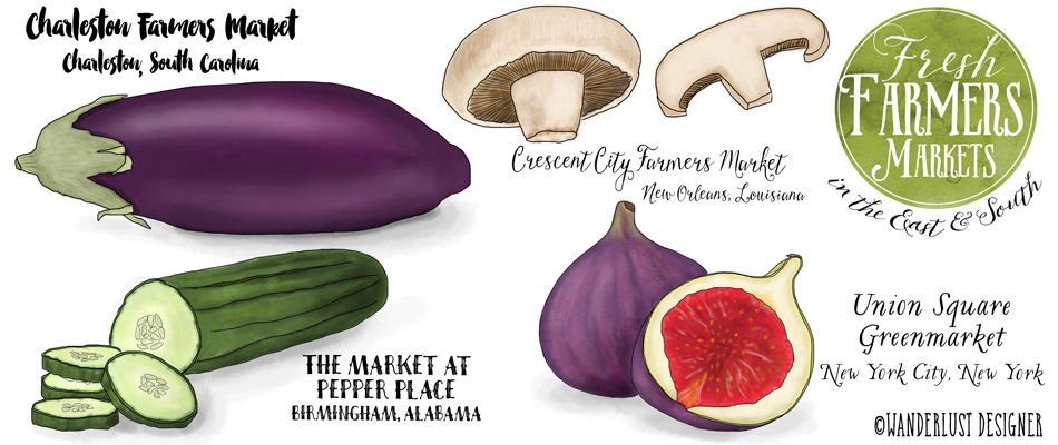
Art and Design
International art styles, color palettes, patterns, textures, textiles, typography, and designs from around the world.
-
Type+Place: Las Vegas Neon A to Z
I’ve had an obsession with vintage neon signs for a very long time! During my undergrad, I scoured the Southwest on a road trip photographing dilapidated signs and marquees, stopping even at the most inconvenient time to get a good shot. Well, the obsession continues… With a recent trip to Las Vegas, and a visit to the Neon museum, my love for neon grew once again. This time it wasn’t just the neon that fascinated me, it was also looking more closely at the typography and styles. Once home, I knew what I had to do– an A to Z to honor the wonderful letters that are rusting in the…
-
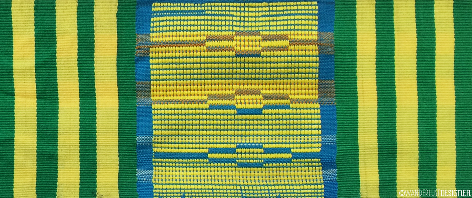
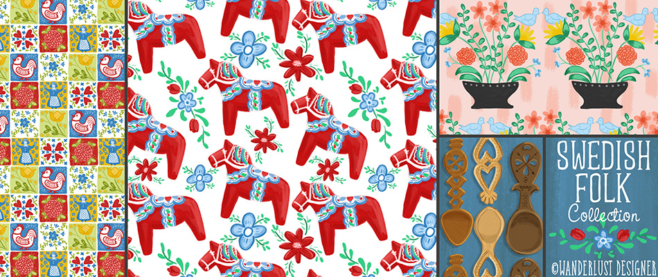
Pattern+Place: Colorful Kente Cloth from Ghana
Known for it’s bright, bold colors and geometric patterns, Kente cloth is one of the most recognizable textiles from Africa. Kente cloth weaving originated from the Ashanti Kingdom and Akan people of Southern Ghana. Historically it was worn by royalty and prestigious people for important occasions. With the advent of commercially woven cloths, it is now seen on everyday clothing and items which some feel has diluted the cultural importance of the art form. Traditional weaving of Kente cloth is done in very long 4″ strips. Then, the strips are then sewn together to make fabric. The pattern and color usage are are highly symbolic. For instance, black represents maturation…
-
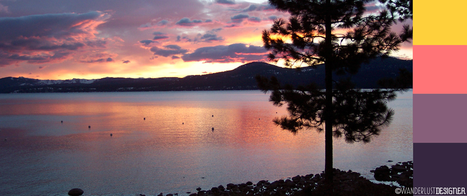
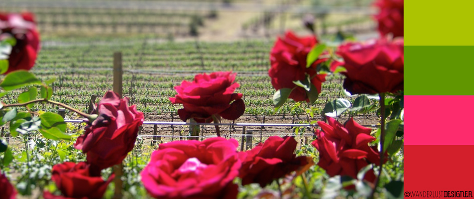
Palette+Place: Sunsets at Lake Tahoe
This New Year in Lake Tahoe, California we were treated to quite a show. Night after night we were dazzled with pure visual entertainment. Jaw dropping colors magically changed before our eyes and in a matter of minutes it was over. No this wasn’t some marketing stunt put on by a glitzy casino, or a laser light show at the local high school, this was just Nature doing her stuff. With 4 decades of trips to Lake Tahoe, and a 2 year stint living there, I’m convinced Lake Tahoe sunsets are some of the best in the world. Night after night the sun dips behind the Sierras and the sky…
-
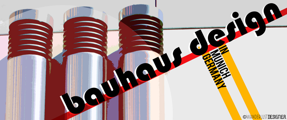
On Location: Bauhaus Design on a Random Munich Street Corner
Tucked off the main thoroughfare, in a maze of alleys far from foot traffic and cars to admire, three gleaming cylindrical pillars stand tall and proud against the corner of a modern building. They prominently flank the clean lined siding as if performing a function that we should all understand. At the top of each pillar is a black accordion detail, adding another unknown function, yet graphic element to the entire look. In front of the cylinders is a street pole, disseminating important information to anyone who cares to read. Einbahstrasse states the blue arrow pointing right, signaling the start of the one way street. Feuerwehranfahrtzone labels the red x…
-
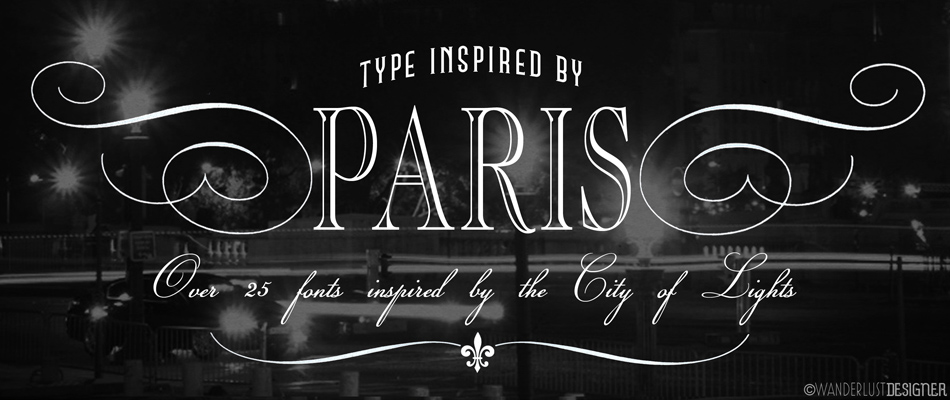
Type+Place: Over 25 Fonts Inspired by Paris
It’s amazing how a typeface can look and feel so much like a famous city such as Paris! In continuing with my font fetish, I’ve gathered up over 25 fonts that exude the City of Lights. These are perfect to use post-travel when you are putting your memories together of your trip or great to use for any design project where you want it to speak of Paris. I have a feeling there will be another Paris-font series to come. It seems like so many fonts didn’t make this list. Be sure to stay tuned for more. Below is a list of links to the fonts used above. Note: These…
-
Palette+Place: Fireworks over Lake Tahoe
There’s nothing like a fireworks show up close and personal! I’ve been lucky to be able to watch many firework shows with an unobstructed view in beautiful Lake Tahoe, California. Lake Tahoe hosts at least 4 different firework displays, so for the past several years, the community has decided to divide up the shows between July 3rd and July 4th. The display closest to my family’s cabin just happens to always fall on July 3rd. Although it’s not actually Independence Day, I find it a great way to kick off a long weekend or holiday the next day. Below are some photos I took from this year’s show. Enjoy, and…
-
On Location: Seattle’s Gum Wall – Abstract Art or Janitor’s Worst Nightmare?
After a wonderful walk through lively Pike’s Place Market, my nieces were eager to show my family and I more Seattle sites. Outside the market place we went, and onto adjacent Post Alley. I see the dutiful graffiti and bills posted for this concert and that political message. It doesn’t take long though to get past the typical “alley” graffiti and come face to face with a janitor’s nightmare. Gum. Loads and loads of gum. Gum smeared inches deep in some parts. Plastered on the wall for all to enjoy. My daughter’s expression sums up my initial feeling of Gum Alley as it is affectionately named. Eeeewww. To think how…
-
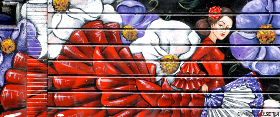
Palette+Place: The Colorful Mission District, San Francisco
Even on a foggy day, the Mission District in San Francisco shines with color. The streets and alleys of this hip and trendy neighborhood are filled with murals and street art reflecting the artistic and diverse population that reside here. Although I lived in the city for over 10 years, and have spent many-a-night out at the bars and restaurants in this neighborhood, I had yet to photograph the amazing street art during the day. What a treat I was in for. There are 2 alleys in “the Mission” that are most popular for the murals and street art, Clarion Alley and Balmy Alley. Most of these photos below are…
-
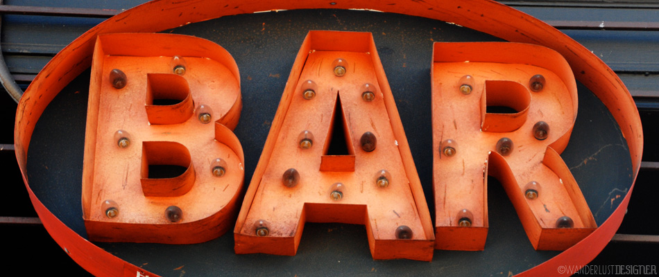
Type+Place: Bar Time!
It’s 5:00pm on a Friday, it must be bar time! I took this shot while hanging out in the Mission District of San Francisco. I couldn’t resist these marquee letters. Weathered, rusty, and red, they are quite trendy to have as decoration in your living room these days! After taking a few shots, I got a little bummed out that I wouldn’t be able to see them light up– it was only 12:30 in the afternoon. In comes the magic of photo post-production. With a few modifications, and using a very low-tech animation technique in Photoshop, I got my sign to light up. Now that it’s on, it’s time for…
-
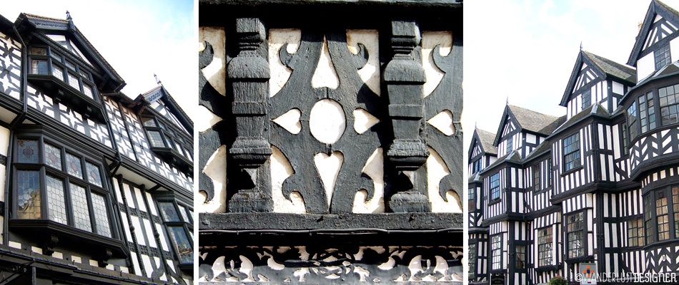
Pattern+Place: The Graphic Tudor Timber Framing of Shrewsbury
I learned at the ripe old age of 8 what Tudor style or timber framed architecture was. Seems pretty young to be studying architecture, huh? Well, really I wasn’t studying it, it just happened to be the style of house we moved into. This is the same house my parents still live in today, many, many years later. My childhood home is in California, not really the place you’d expect a lot of Tudor architecture. Our home is rather old by California standards (it was built in the 1930’s), but by European standards, it’s just a baby. So, when I traveled to Shrewsbury, England, I was so excited to see…