-
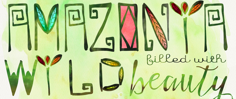
Type + Place: A Free Font Inspired by the Amazon – Amazonía
I’m so glad hand lettering is in fashion these days! I am definitely smitten by the trend. So much so that, as part of my New Years resolution to create something every day, I’ve chosen to devote Wednesdays to typography. Today, as a fun exercise, I chose to make a font inspired by a location. Randomly, I pointed to a world map and landed on the Amazon in Brazil. Imagery of this wild and beautiful location flew through my head – from soaring trees and dense rain forests to tribal tattoos and exotic bird feathers. Using the app (on my iPad) called iFontMaker, I hand drew the upper case letters to this font below.…
-
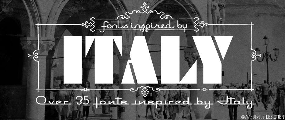
Type+Place: 35+ Fonts Inspired by Italy
As we wandered through the narrow streets of Venice, Italy, I couldn’t help but notice all the different store signs. Many of them had such quintessential Italian style with the use of typography. The stylized scripts, clean, modern fonts and even the traditional serif fonts all made me think of classic Italian graphic design. To celebrate the look, I decided to compile a list of fonts that celebrate Italian style. Below is a list of the fonts used in the image above. Note: These fonts may be free or may have a charge to download. Be sure to read the usage rights as well, they may vary per font. Mingo…
-
Type+Place: Las Vegas Neon A to Z
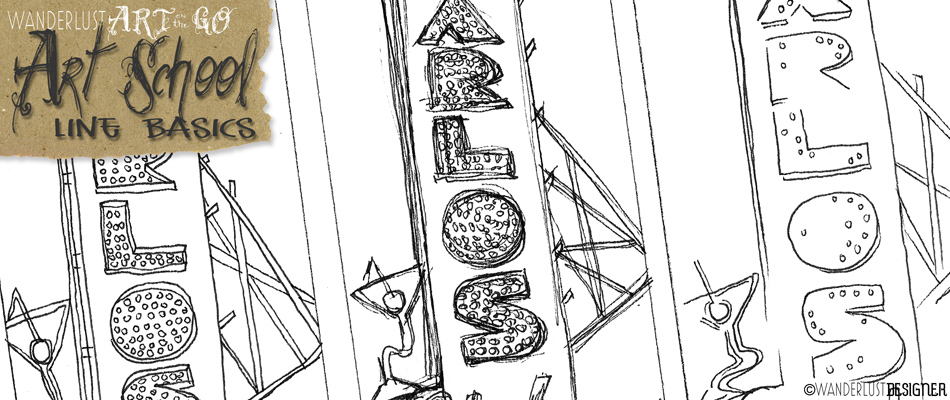
I’ve had an obsession with vintage neon signs for a very long time! During my undergrad, I scoured the Southwest on a road trip photographing dilapidated signs and marquees, stopping even at the most inconvenient time to get a good shot. Well, the obsession continues… With a recent trip to Las Vegas, and a visit to the Neon museum, my love for neon grew once again. This time it wasn’t just the neon that fascinated me, it was also looking more closely at the typography and styles. Once home, I knew what I had to do– an A to Z to honor the wonderful letters that are rusting in the…
-
On Location: Neon Heaven at the Neon Museum in Las Vegas, Nevada
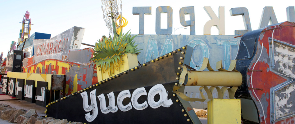
They flashed and illuminated the Las Vegas skyline for years. They told weary travelers to stop and get some rest. They pointed hungry patrons to grab a bite. They lured eager gamblers to spend their hard earned money. There’s nothing more mesmerizing than a bright neon sign to tantalize your eyes and possibly make you do things you didn’t plan to do. But, at one point, the hotel closes, the restaurant shuts down, or the decrepit casino implodes, making way for something more modern, something new. So where do these iconic signs go to die? Fortunately not all are left for scrap and destroyed. Many headed to a boneyard owned…
-
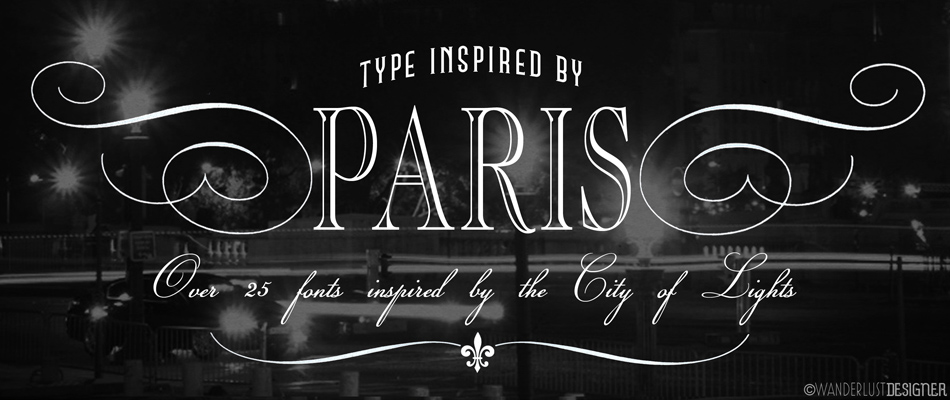
Type+Place: Over 25 Fonts Inspired by Paris
It’s amazing how a typeface can look and feel so much like a famous city such as Paris! In continuing with my font fetish, I’ve gathered up over 25 fonts that exude the City of Lights. These are perfect to use post-travel when you are putting your memories together of your trip or great to use for any design project where you want it to speak of Paris. I have a feeling there will be another Paris-font series to come. It seems like so many fonts didn’t make this list. Be sure to stay tuned for more. Below is a list of links to the fonts used above. Note: These…
-
Type+Place: Bar Time!
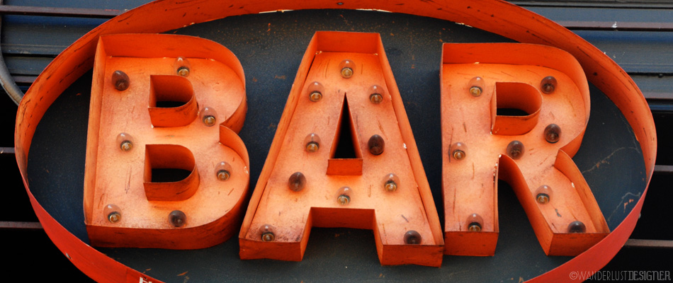
It’s 5:00pm on a Friday, it must be bar time! I took this shot while hanging out in the Mission District of San Francisco. I couldn’t resist these marquee letters. Weathered, rusty, and red, they are quite trendy to have as decoration in your living room these days! After taking a few shots, I got a little bummed out that I wouldn’t be able to see them light up– it was only 12:30 in the afternoon. In comes the magic of photo post-production. With a few modifications, and using a very low-tech animation technique in Photoshop, I got my sign to light up. Now that it’s on, it’s time for…
-
Art on the Go: Typography Photoshoot in Your Town
There’s nothing like scouring the cities of Paris, London or Rome and stumbling across vintage signs and old stylized type to photograph– but sometimes, just looking around your own town, you’ll be surprised at what you might find! Although I wish I could travel full-time, the reality is I have kids in school, and a husband with a great job (in an office of all things)– so for now in our lives, we travel during the school breaks. Perhaps that will change soon, but in the meantime, while at home, how can I starve off my incredible wanderlust? Why not head out my own front door on a photo shoot,…
-
Type+Place: Pike Place Market
I have yet to be at the Seattle Public Market when there wasn’t hoards of crowds. Last weekend, it wasn’t any different– in fact, I must say it was actually worse. My guess is it had to be because of the weather. Unlike most grey, drizzly days in the Northwest, the sun was out and couldn’t have been shining any brighter. Spring was in the air and everyone was enjoying it! Despite the crowds, there’s nothing like a visit to Pike Place Market when in Seattle. The fresh fish, flowers, veggies and more are a sight to see, but if you look beyond the vendors there is also fabulous typography.…
-
Type+Place: County Fair Rides
There’s nothing like a county fair! The rides, the food, the ribbons, the animals, the people watching… In the past, I would imagine it was highly anticipated yearly gathering to head to the fair. Although times have changed quite a bit, I do still love going to county fair. There are aspects that can be a little run down and a tad bit seedy… but if you look past the dust, grime, very unhealthy food– it definitely has it merits. These photos are of the rides at the California Mid-State Fair in Paso Robles. Just some great, bright colorful type– lightbulbs and all. When these light up at night, it’s total…
